The art of color design is a skill that can transform a living space from drab to delightful. However, understanding how to interweave aesthetics with function to produce an inviting and infectious interior aroma of colors is not always intuitive. From research and interactions with some of the most expressive creatives today, we have gathered key insights and practical lessons that you can adapt to make your living space pop with color.
Color is subjective and can be incredibly personal. People are drawn toward varying hues that resonate differently with their tastes and personalities, which is why there is no definitive right or wrong. Max Hurd, a creative consultant, created an interior filled with contrasting colors, styles, and sentimental trinkets – a vibrant result that perfectly personifies his style. He embraced the unconventional ideal of a multicolored rainbow house, which may not suit everyone but overflows with his personality. Fee Greening also used a similar personalized approach with her home, selecting deep, earthy tones that worked for her and her partner.
Getting started with color design can tend to be daunting, with the fear of the result looking tasteless often serving as a barrier. However, the worst possible outcome is that you will have to repaint, but that shouldn’t deter you from making a bold step. An example is Rosi de Ruig, a lampshade maker, who had to change her sitting room’s color from a cold sky blue to a softer pink. This was a discovery that both paint and color are elements easily altered. Luke Edward Hall and Duncan Campbell also had to rethink the color palette of their cottage following a minor fire incident, which turned out better than anticipated.
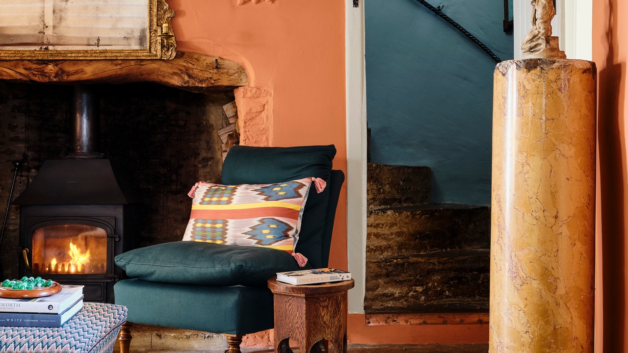
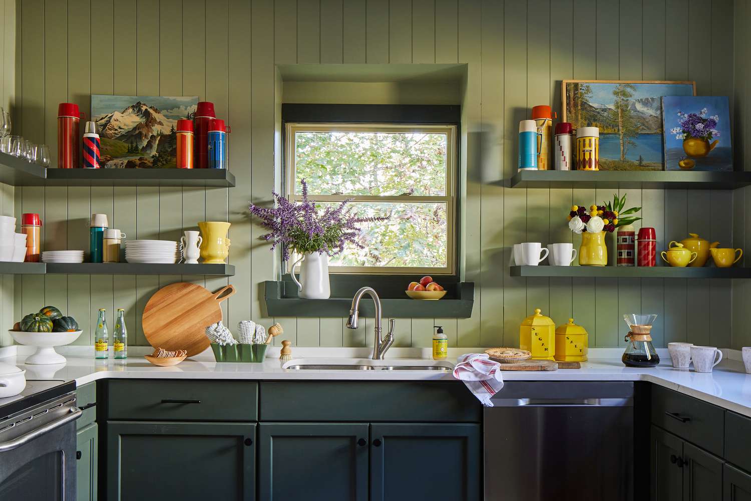
Objects in a room can also be an effective tool in injecting color and pattern. Tobias Vernon, a gallerist, and the founder of 8 Holland Street, demonstrates this fact in his Somerset cottage filled with well-curated everyday objects that unleash a brilliant array of colors and styles. A similar illustration is Mark Homewood, head of buying and retail at Designers Guild, who is an ardent supporter of using color and pattern through physical objects that can also be rearranged at whim.
Bold colors are best suited for small rooms, such as toilets, hallways, and utility rooms. Interior designer Carlos Garcia, for instance, painted the upstairs hallway of his 17th-century Norfolk farmhouse a vivid turquoise that creates a joyful surprise while James Mackie adopted the use of punchier colors fused with daring wallpapers for the minuscule rooms of his Cotswold cottage. These areas tend to be less frequented, which offers the opportunity to be more explorative and adventurous without overwhelming the house’s overall tone.
Patiently understanding your space will ultimately lead to better color decisions. Architect George Saumarez-Smith spent over a decade in his 1860s house in Winchester before he understood how color could influence the interior. As a result, he chose strong colors for his hallway and kitchens. Patience has a significant bearing on the outcome of color design— allowing it to evolve organically over time can yield surprising and pleasing results. The enriching aura that comes from carefully considered color choices not only provides a visually pleasurable environment but also makes a house feel more homely, reflecting the personal preferences of those that live within its four walls. Whether you are a fan of bold hues or quieter, more neutral tones, these insights will help to guide you in your own color exploration journey.


